Being involved in the startup world means I like keeping an eye on the current trends. One of my methods is checking out the Y Combinator companies, especially around Demo Day. After skimming the three Techcrunch updates published earlier this week, I clicked through to some of the sites and noticed that the designs were very, very similar (I happened to choose Watchsend, Hackermeter, and SimpleLegal). Interested, I decided to come up with some metrics (completely off the top of my head) for a simple analysis of any design trends.
But first, some visualization. I wanted to view each homepage to see any discernible patterns. Tabs, tabs, tabs, tabs.


After some time (admittedly too much), I created the following checklist for my "metrics" based on what I had seen and what I wanted to measure (I explain my methodology in each section). I measured:
The following is the data I collected (aka counted, tediously) from the 42 homepages I found links to. I didn't control for anything, it's just the numbers and averages with some interpretations by me on my little experiment. Enjoy.

Color themes and background images create a "feel" based on their combined lightness or darkness. It's something users notice right away, whether consciously or unconsciously. This is a very subjective metric - I chose to calculate lightness based on my own interpretation of the page, after scrolling. I wanted to include the lightness of elements below the fold because they also contribute to the "feel" of the site.
52% of the homepages had a predominately light feel, 12% were felt dark, and 36% were either a combo of light and dark or very colorful. Blue was the most popular color (no surprise).
One trend I've seen used more and more frequently is an edge-to-edge background image as the primary background of the homepage. By "primary background", I mean the main visual elements displayed when the homepage loads, before the user scrolls. Of the 42 sites, 52% had the edge-to-edge image or graphic (including Hum's beautiful and mesmerizing MP4 video background). The other 48% had a variety of other background elements including: smaller graphics, textures, flat colors, videos, text, or a combination.
33% - Edge-to-edge photo (including stockphotos)
12% - Edge-to-edge highly blurred photo
5% - Edge-to-edge custom graphic
2% - Edge-to-edge video
48% - Something else

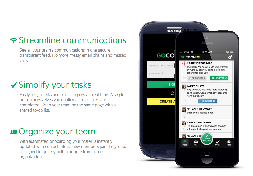
One obvious pattern was the presence of Apple products on a homepage. I didn't count total instances, I just counted number of pages containing a device (including illustrations). The only page containing a different device was GoComm, and the Samsung phone on that page is only half visible behind an iPhone. Looks like these startups, and the products they build, love their Apple products.
38% of the homepages contained an Apple product. The y-axis in the bar graph is percentages.
I choose to measure a few additional random variables including: the presence of any type of input for a user's email on the homepage, pages with a video or animated demo, sites with press logos on the homepage, if a startup clearly displayed prices on their homepage, and if the homepage contained circular photos of people's faces (founders, advisors, user testimonials etc). The y-axis is the percentage of the 42 homepages that have the variable present.
The most interesting discovery for me was that almost half of the pages had an email input on them, either for demo requests, beta invites, contact forms etc. In hindsight, this isn't that surprising because of how young some of these companies are.
In closing, this took much more time than I anticipated, but it was still a fun and valuable experiment that highlights some clear trends employed by some of Silicon's Valleys most scrutinized startups. Whether these startups are helping create these design trends or just following suit is something I'm not sure of yet. But I do know that there is currently a clear "style" to many of these websites and as a product/web designer, it's something I should be aware of.
It seems that many founders are more concerned about product differentiation and product-market fit, but I think there is also plenty of opportunity for website differentiation, to help your young brand standout from the crowd and receive a closer look by potential customers. The homepages that delight their visitors, like Hum did for me, are the one's that have the best shot at being remembered.